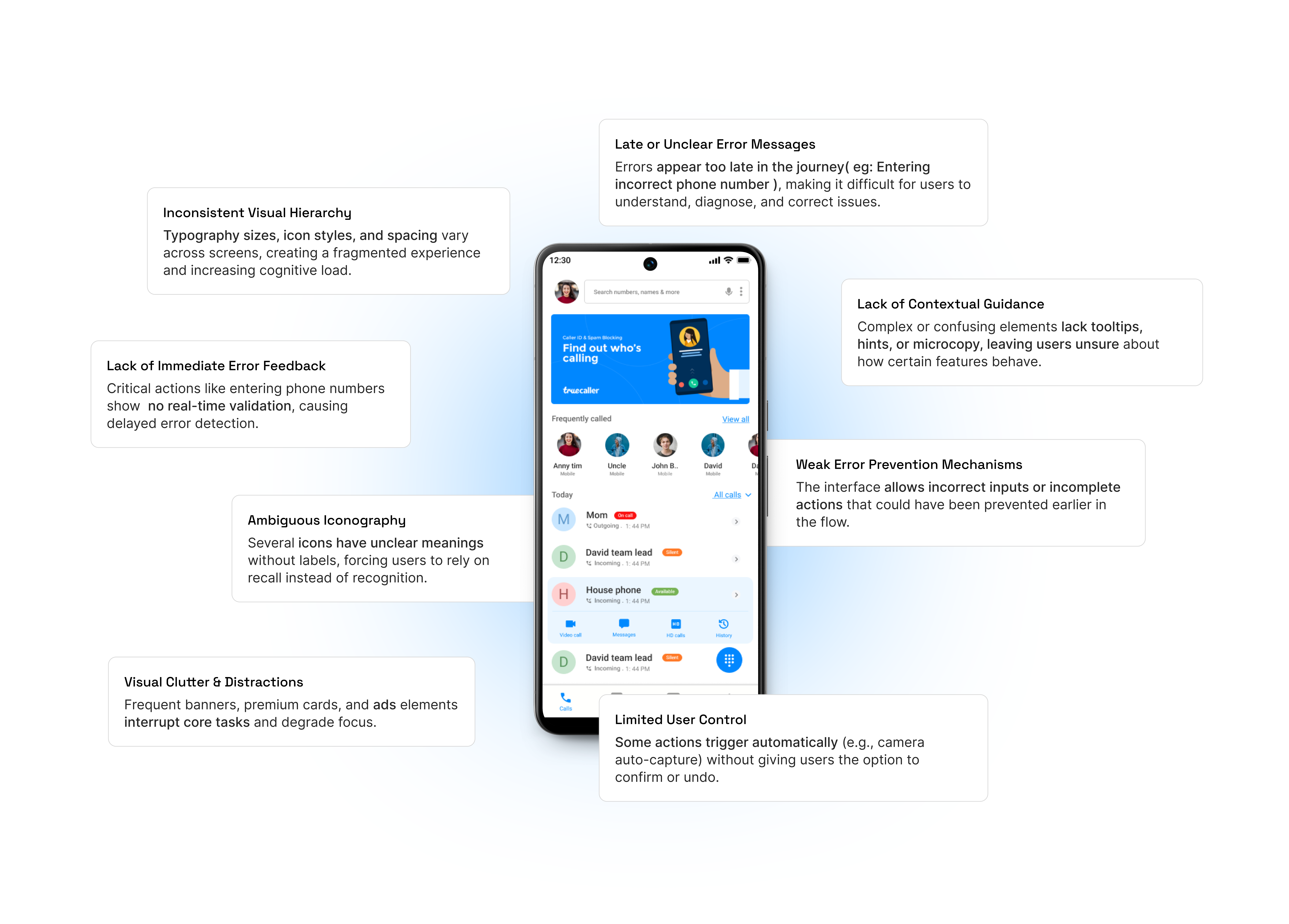
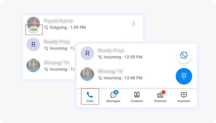
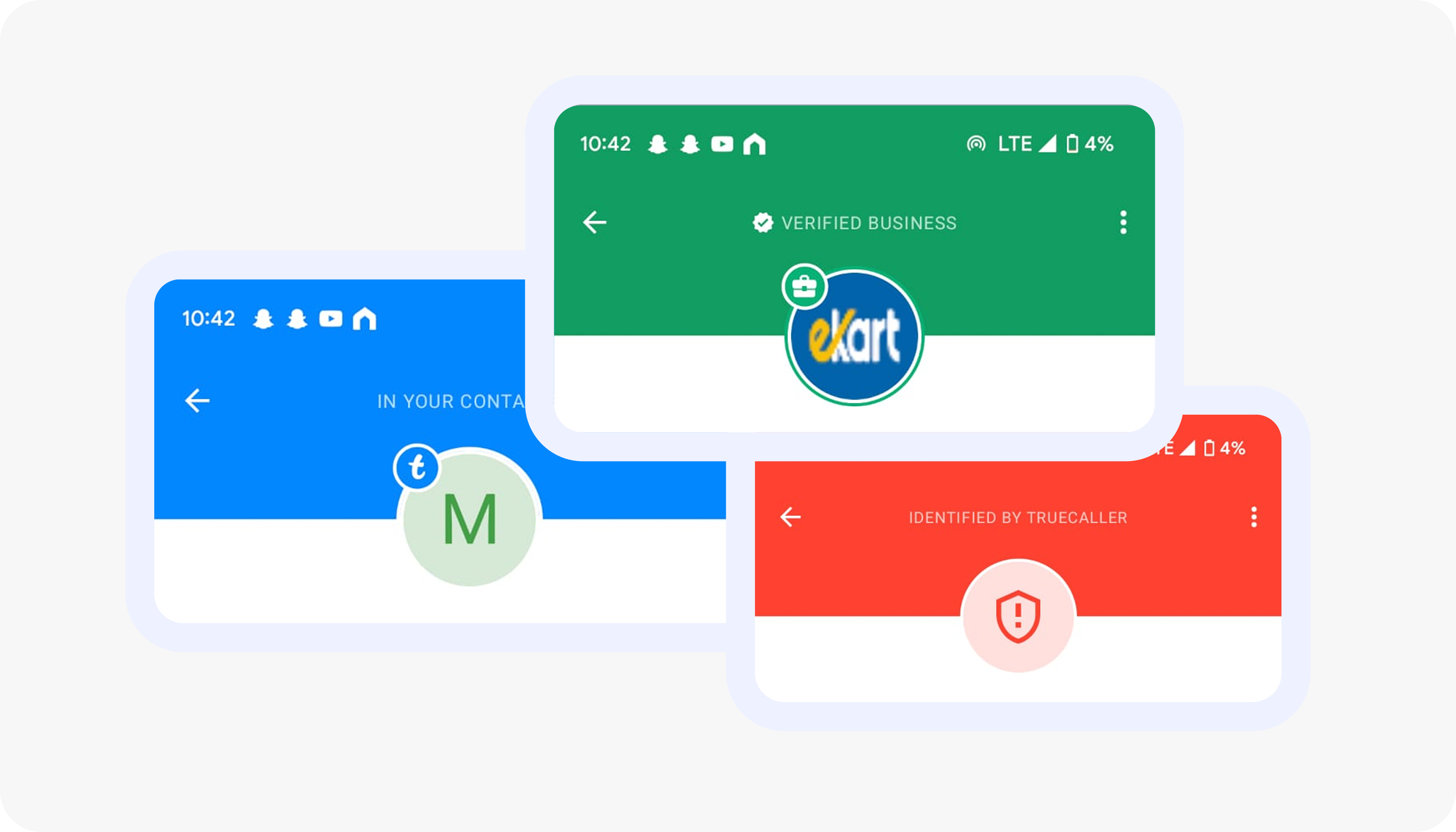
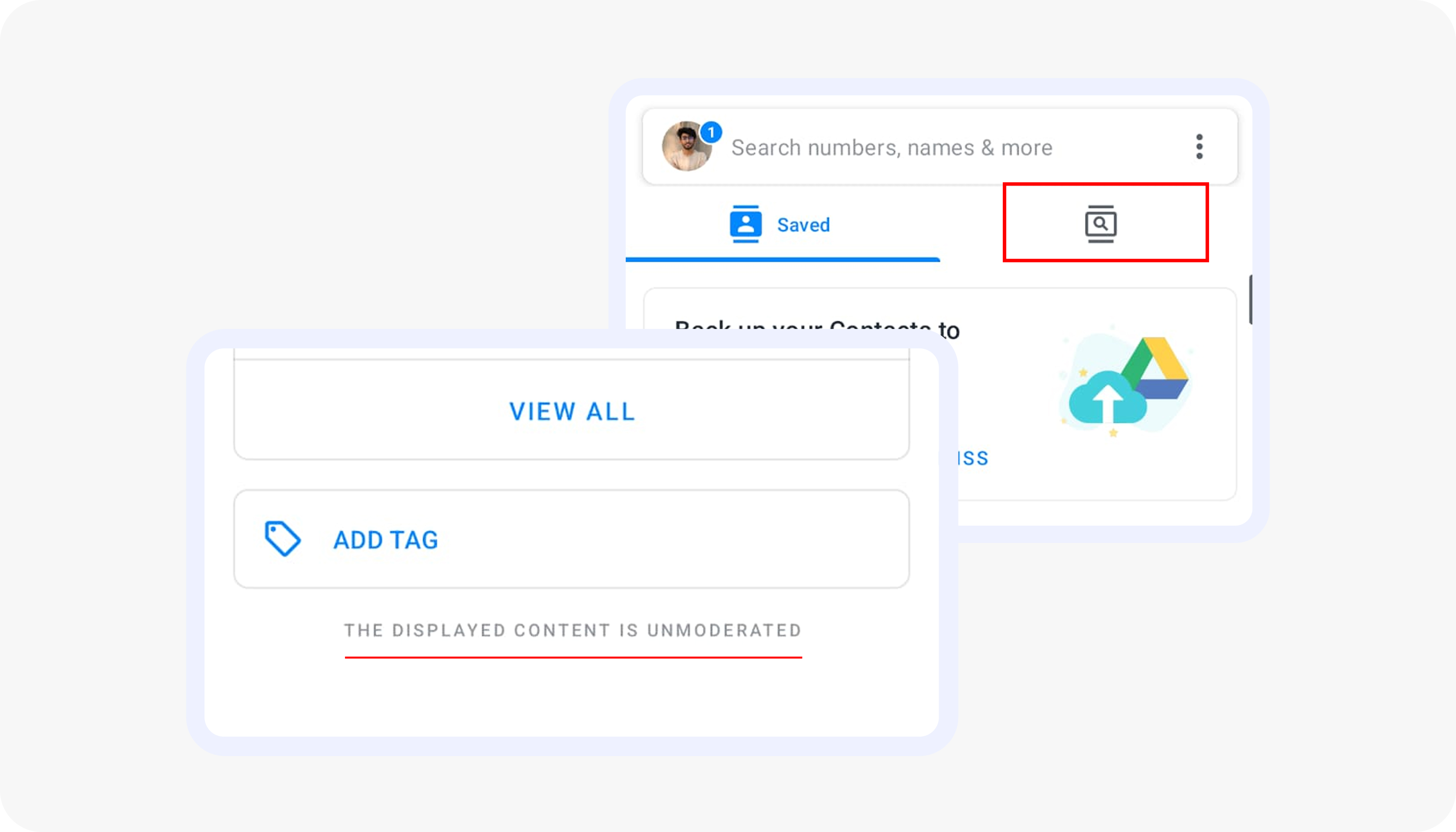
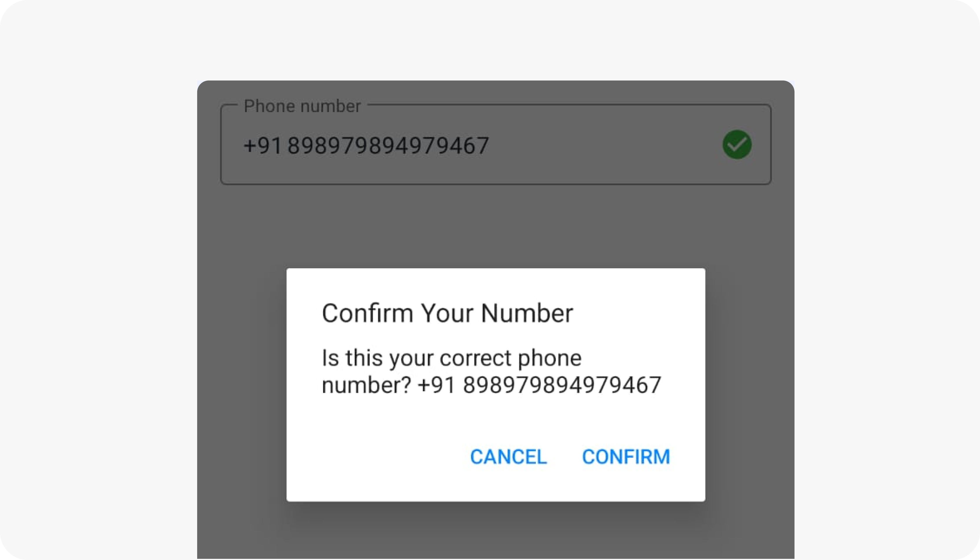
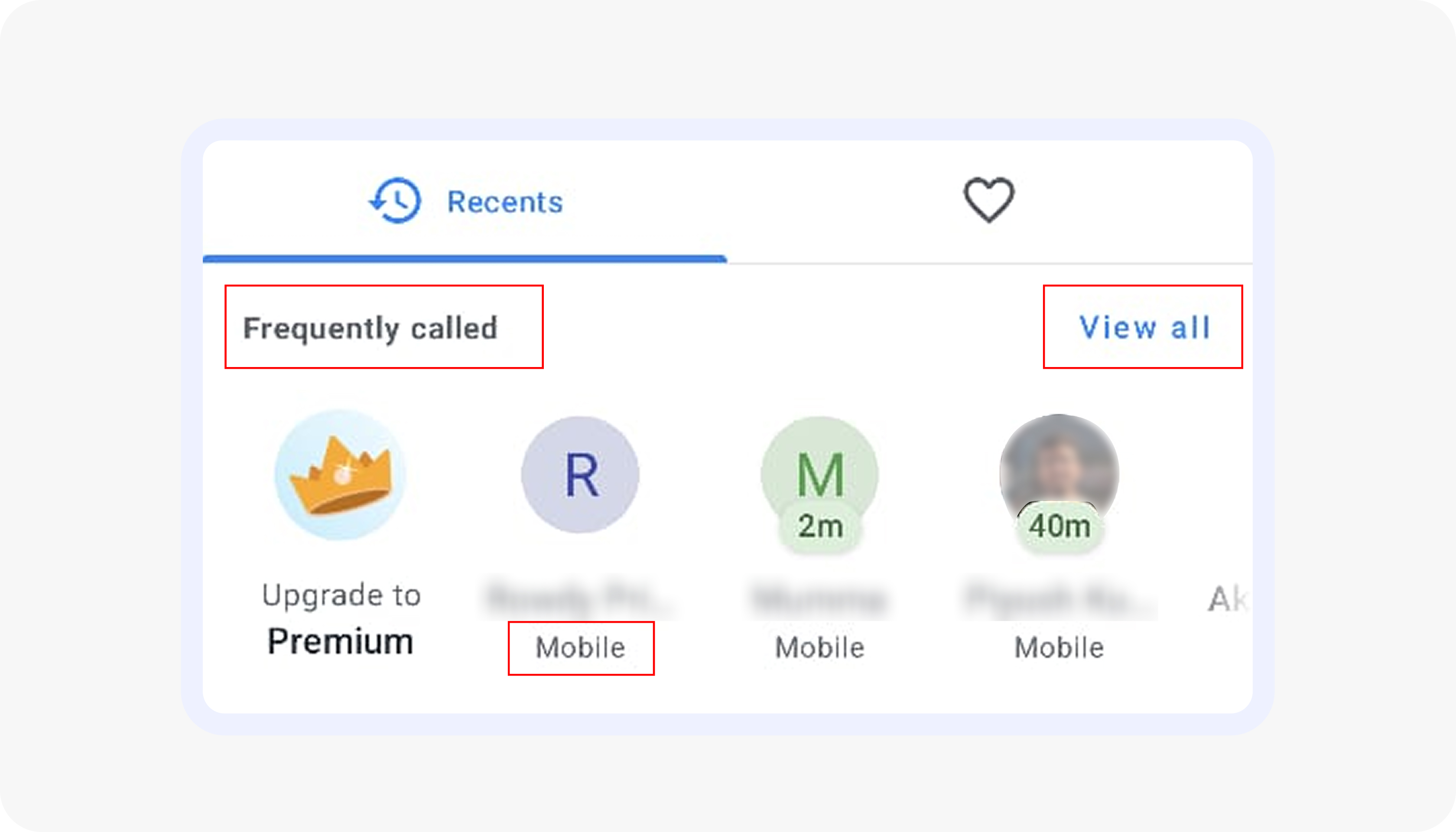
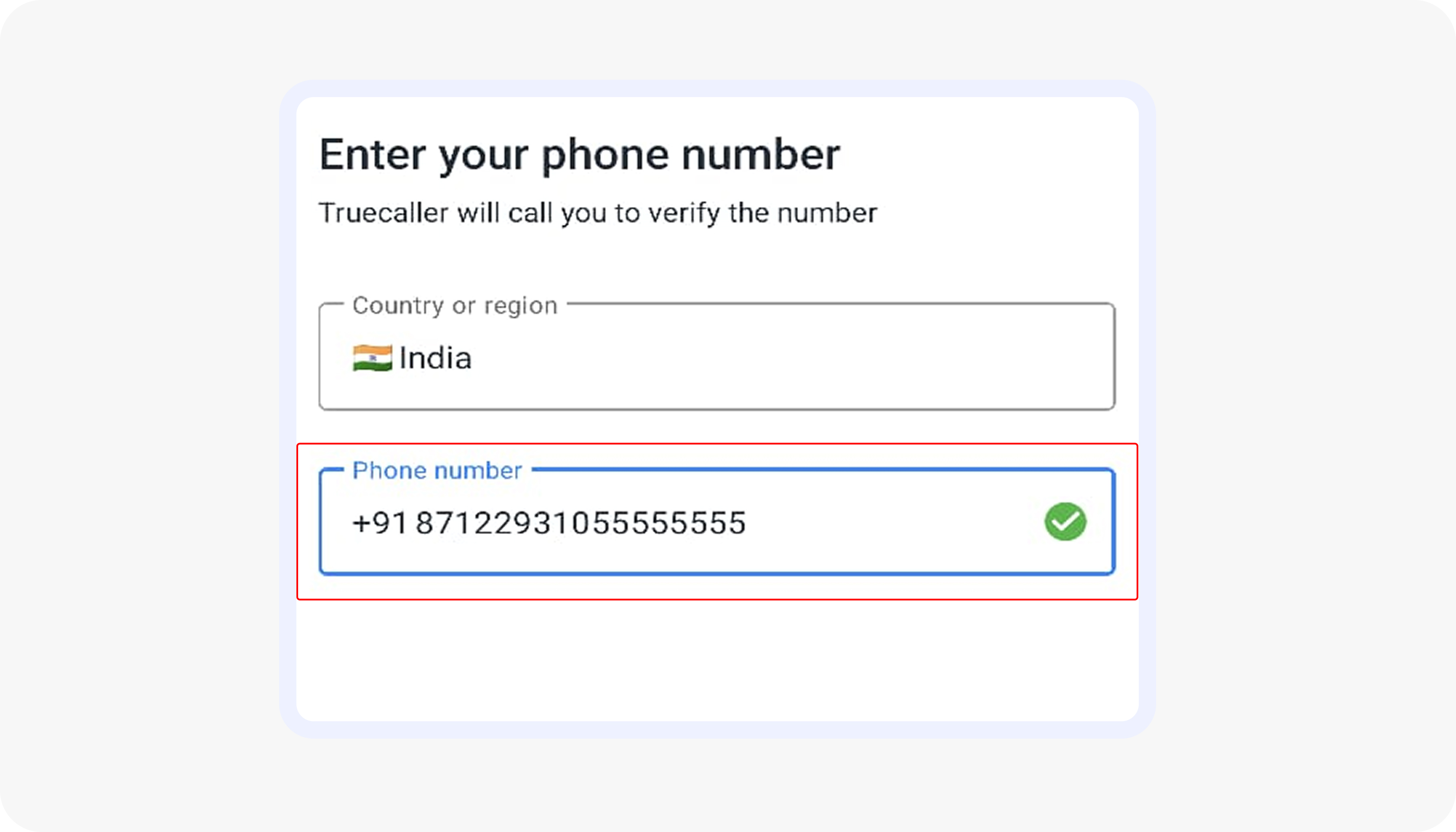
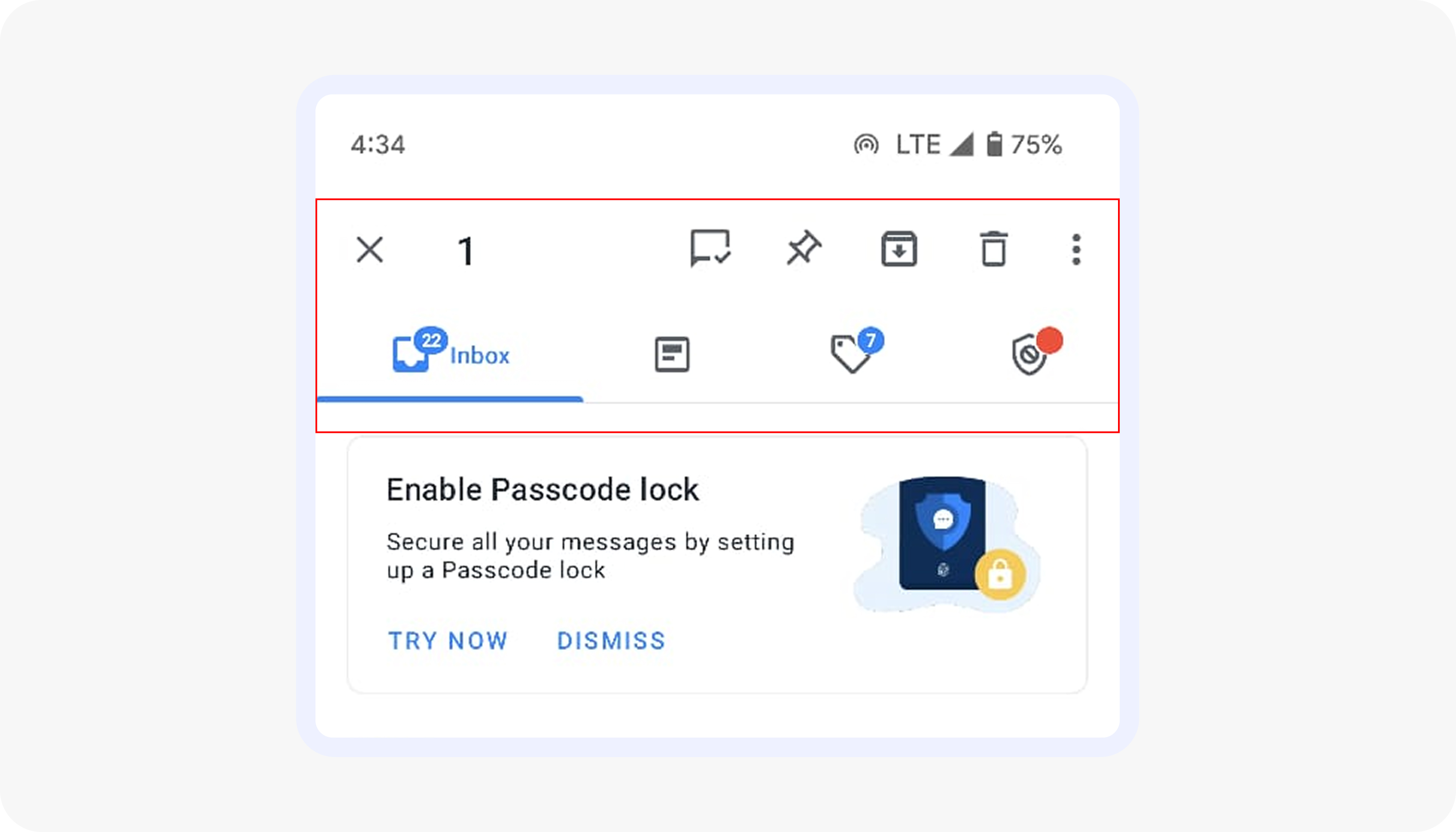
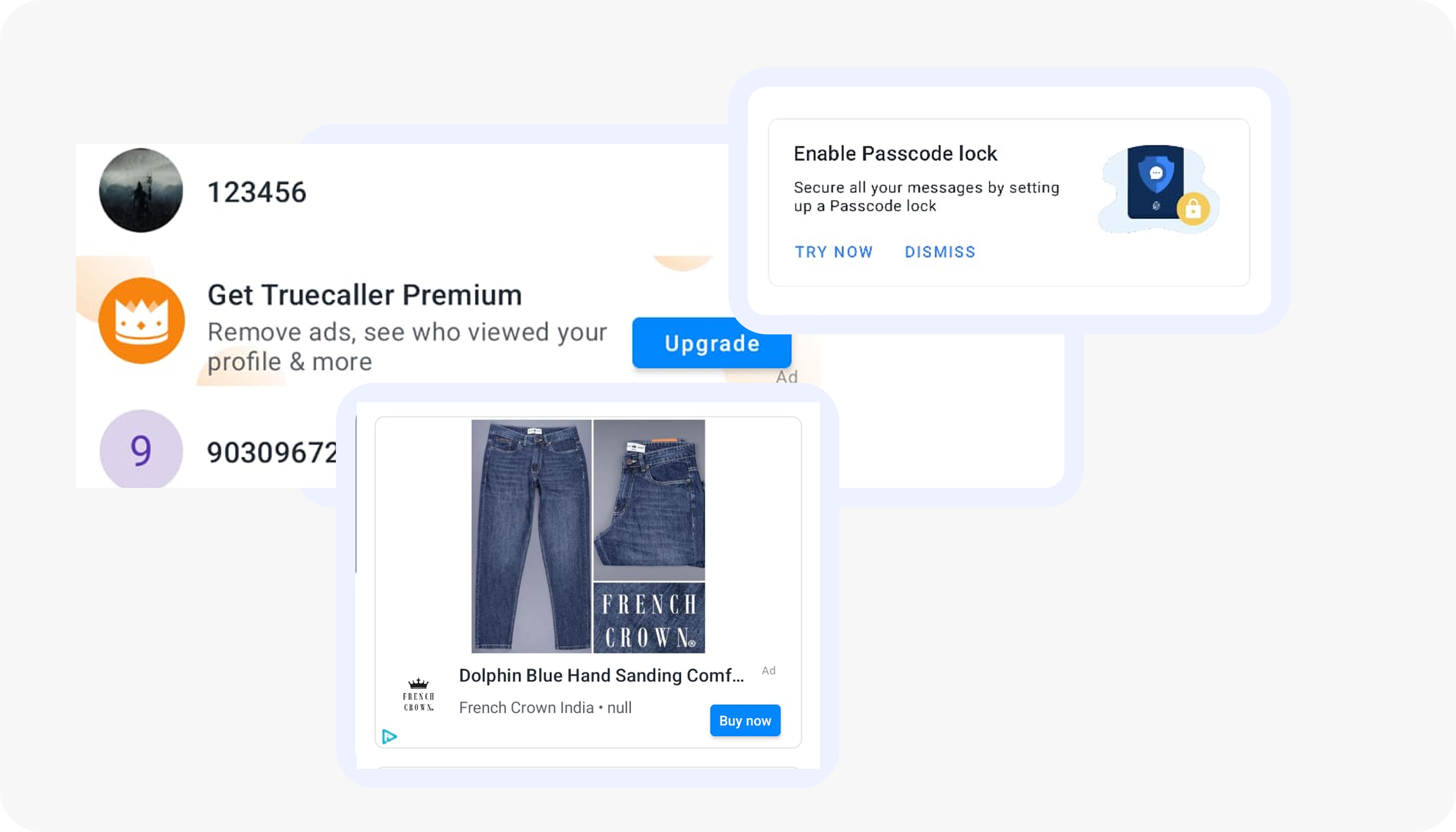
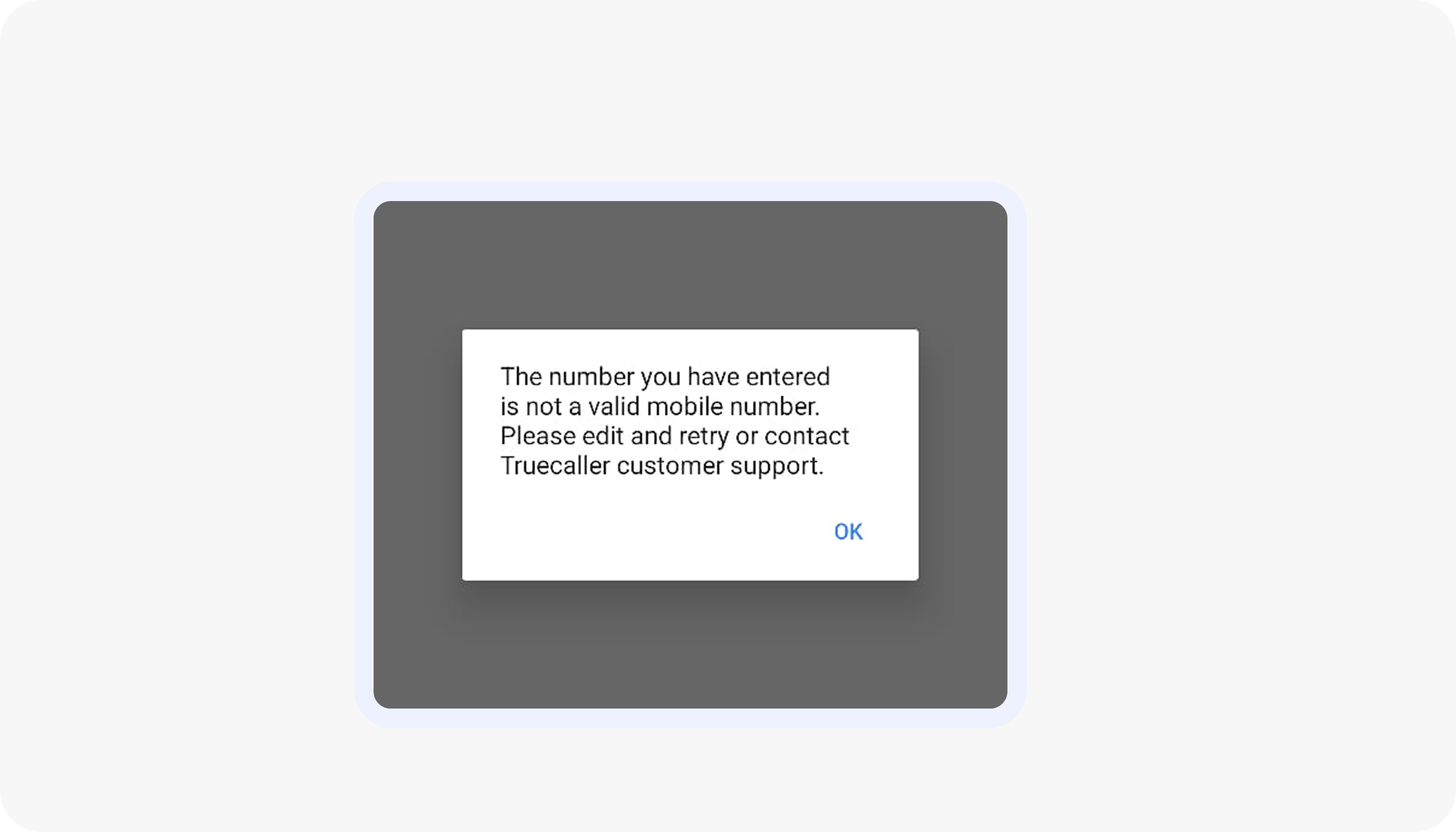
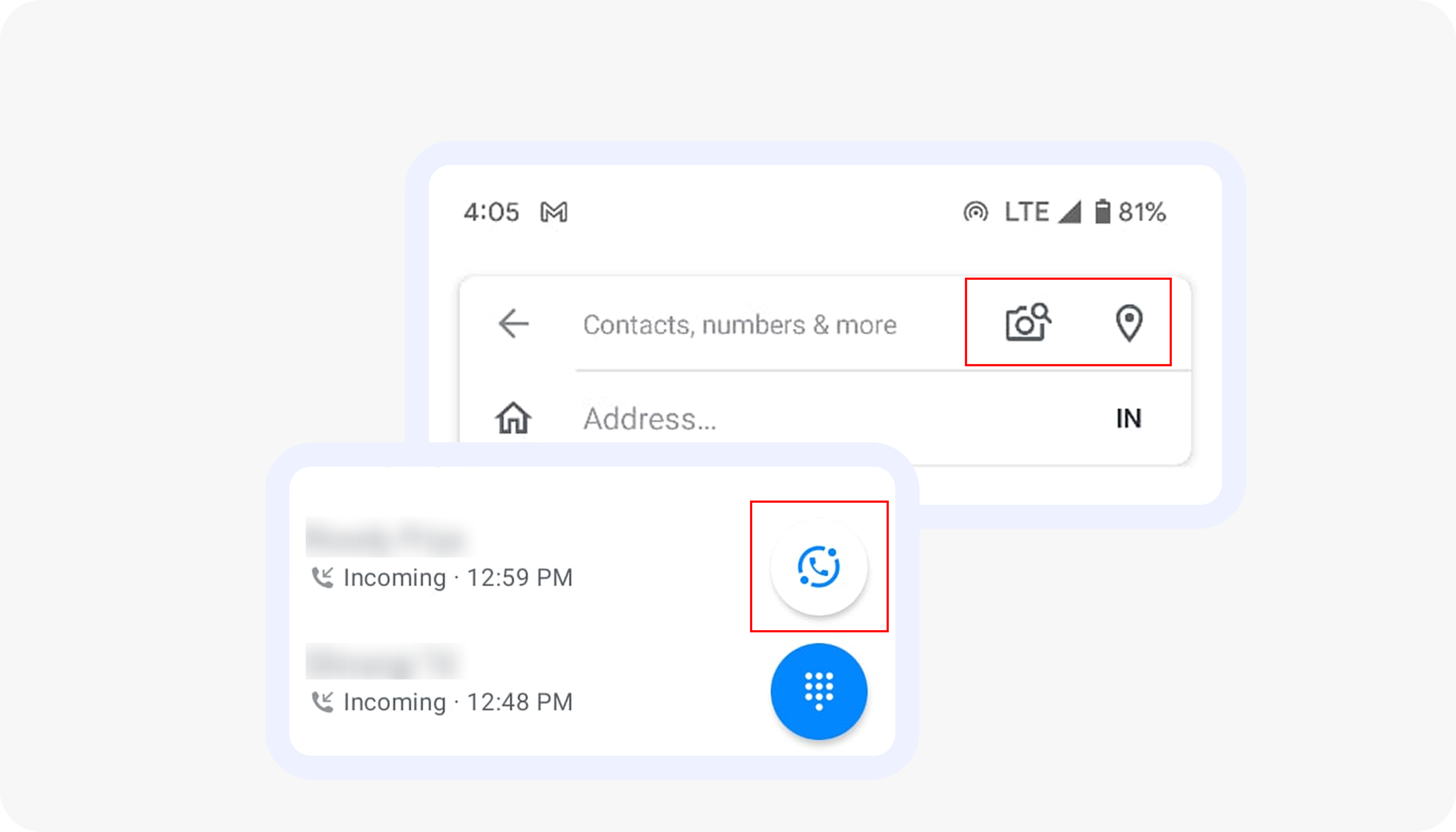
A fast, insight-driven UX sprint where I evaluated Truecaller using Nielsen’s 10 heuristics, identified issues & gaps in the user experience.
The current Truecaller experience shows several usability gaps that affect clarity, feedback, and trust during everyday interactions.
Through frequent use, I sensed there were deeper friction points, so I conducted a short heuristic evaluation using Jakob Nielsen’s 10 usability principles to identify them.
Note: This was a quick, exploratory assessment carried out as part of a fun design activity, not a comprehensive formal audit.
When users navigate to different sections within the app, the corresponding bottom bar icon is highlighted, providing visual feedback to confirm their selection, while also displaying incoming and outgoing call times/durations.
Severity rating - 0
Color is used well across the app to signal trust levels, allowing users to quickly differentiate fraud calls from verified numbers.
While the system is consistent, some hues (particularly the red) are overly sharp and could be improved to meet WCAG accessibility standards.
Severity rating - 1
Use icons that are either paired with labels, self-explanatory, or widely recognized, so that users can easily understand their function and are familiar with their usage. If not, provide a label for clarity.
Severity rating - 3
The app provided user freedom to recorrect his/ her phone number if entered incorrect, user can cancel and rechange the number however if the user confirms there is no back button for the user to change it making it frustrating.
The app should not allow user to enter more than 10 digits for a number.
Severity rating - 3
The app employs multiple font weights and sizes, leading to visual inconsistency and disrupting the overall user experience. Consistent typography is crucial for maintaining visual hierarchy, readability, and brand identity.
Severity rating - 2
When users enter an incorrect contact number, there's no instant validation or error feedback, and the absence of a back button limits the ability to quickly correct mistakes.
Severity rating - 4
The iconography used in the app is difficult for users to recognize, and the supporting text that could help in understanding is only visible upon interaction, making it less intuitive and confusing while increasing user’s cognitive load.
Severity rating - 4
The camera automatically captures images without giving users the option to manually take the picture, limiting their control. After capturing the image, the scanned number should be displayed, with options to manually edit incorrect entries or recapture the image.
This would enhance flexibility and efficiency, allowing users to easily save the correct number to their contacts.
Severity rating - 4
The presence of multiple ads and pop-ups clutters the app interface, disrupting the visual appeal and breaking the natural flow of content hierarchy.
This constant interruption not only distracts users but also diminishes their overall experience by making it difficult to focus on the primary tasks. An overload of ads can lead to user frustration and decrease engagement
Severity rating - 3
When users enter an invalid number, they receive an error message only in the later stages of the process, requiring them to go through multiple steps to re-enter or change the number.
A clear error indication should be provided immediately during the initial entry phase to prevent unnecessary steps and streamline the process.
Severity rating - 4
The app fails to offer any help or support to users, leaving users without any guidance when navigating the interface. Additionally, the confusing iconography creates user frustration, as the unclear symbols make it difficult to understand their purpose and functionality.
Severity rating - 4
The heuristic evaluation revealed several recurring patterns across the Truecaller experience that impact clarity, efficiency, and trust. While the app delivers strong core functionality, multiple usability gaps create friction in everyday interactions.
These issues may seem minor individually, but together they create friction and hamper the overall experience of the product.
Want to see the detailed heuristic breakdown with examples and annotated screens? Click the link below to view the complete project:
Go to Full Project